

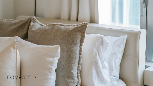
Cushions can change a living room faster than most people expect. They are small compared with a sofa, rug or curtains, but they sit directly in the visual centre of the space. When the colours work, the room feels calmer and more complete. When they do not, even a well-furnished room can look slightly unfinished. The question is not only whether cushions should match the sofa or stand out against it. The better question is what role they need to play in the room. For people choosing IKEA cushion covers, this decision often comes down to balance, contrast and how much attention the sofa area should attract.
Matching cushions create a calmer look
Matching cushions work best when the living room already has enough visual activity. This may be the case when the room includes patterned curtains, a textured rug, open shelving, artwork or several furniture finishes. In that situation, cushions that stay close to the sofa colour can help the space feel more organised.
Matching does not mean every cushion must be exactly the same colour. A more natural approach is to stay within the same colour family. A beige sofa can work with cream, oatmeal, sand or warm grey cushions. A dark grey sofa can be paired with charcoal, soft black, cool grey or muted blue-grey. The effect is subtle, but it prevents the sofa from becoming visually flat.
This approach is also useful in small rooms. Strong contrast can sometimes make the sofa area feel busier, especially when there is little space around it. Matching tones allow the eye to move across the room more easily. The room may feel larger, softer and less crowded.
The risk is that matching can become too safe. If the cushions are too close to the sofa in both colour and texture, they may disappear. The sofa then looks tidy but not especially styled. To avoid this, texture matters. A woven fabric, a slightly different shade or a cushion with a simple seam detail can add depth without changing the calm mood.
Contrasting cushions add energy and focus
Contrasting cushions are useful when the living room needs a stronger focal point. A plain sofa can look more intentional when cushions introduce a new colour, pattern or texture. This works especially well in neutral interiors, where the main furniture pieces are simple and the room needs warmth or personality.
Contrast can be created in several ways. A light sofa can be paired with darker cushions. A grey sofa can be softened with rust, olive, cream or muted terracotta tones. A beige sofa can look more defined with deep green, navy or brown. The contrast does not have to be loud. Even a small shift in tone can make the seating area look more layered.
The main mistake is choosing contrast without connecting it to anything else in the room. A bright cushion may look attractive on its own, but it can feel random if the colour appears nowhere else. The easiest way to make contrast look considered is to repeat the accent colour in another element, such as artwork, a vase, a rug detail or a lamp shade.
Contrasting cushions also work well when the sofa is visually heavy. A dark sofa can feel lighter with pale cushions. A very plain sofa can feel less basic with textured or patterned covers. In this sense, IKEA cushion covers can help adjust the character of the sofa without changing the sofa itself.
The sofa colour should guide the decision
The best choice often starts with the sofa. A sofa already has a strong influence on the room because of its size. Cushions should either support that influence or soften it.
With a neutral sofa, both matching and contrasting options can work. Matching creates a quiet, minimal look. Contrast adds interest and can make the room feel more personal. With a coloured sofa, the decision needs more care. A green, blue or rust sofa already makes a statement, so cushions in closely related tones may feel more refined than strong contrast.
Pattern also matters. If the sofa fabric has visible texture, plain cushion covers may be enough. If the sofa is very smooth and simple, textured cushions can prevent the arrangement from looking flat. When using patterned cushion covers, it is safer to keep the rest of the palette controlled. Too many colours and patterns can make the sofa look cluttered rather than styled.
A useful rule is to choose one main direction first: calm or expressive. A calm room can still have detail, but the colours should stay close. An expressive room can still feel balanced, but the contrast should repeat elsewhere.
A practical way to combine both approaches
Matching and contrasting cushions do not have to be separate choices. Many living rooms work best with a mix. The base cushions can match the sofa or stay close to its tone, while one or two cushions introduce contrast. This creates a layered look without making the sofa feel overloaded.
For example, a beige sofa might have two warm neutral cushions, one textured brown cushion and one muted green cushion. A grey sofa might combine pale grey cushions with a deep blue or soft rust accent. The result feels intentional because the matching cushions create structure, while the contrasting pieces add character.
This approach is especially useful for people who like to change the room by season. The neutral base can stay the same, while the accent cushion covers can change. Warmer tones may suit autumn and winter. Fresher shades can make the room feel lighter in spring or summer. The room changes, but the overall style remains consistent.
The number of cushions also matters. Too few can make a large sofa look bare. Too many can make it uncomfortable to sit down. The right amount depends on the sofa size, but the arrangement should still leave space for actual use. A sofa is not only a styling surface.
Which option works better for your living room?
Matching cushions work better when the goal is calm, softness and visual order. Contrasting cushions work better when the room needs definition, warmth or a stronger focal point. Neither approach is automatically better. The right choice depends on the sofa colour, room size, existing patterns and the mood the space should create.
For most homes, the strongest solution is a controlled mix. Use matching tones to connect the cushions to the sofa, then add contrast where the room needs energy. When IKEA cushion covers are chosen with the full room in mind, they do more than decorate the sofa. They help connect separate interior elements into one clearer, more comfortable living space.