
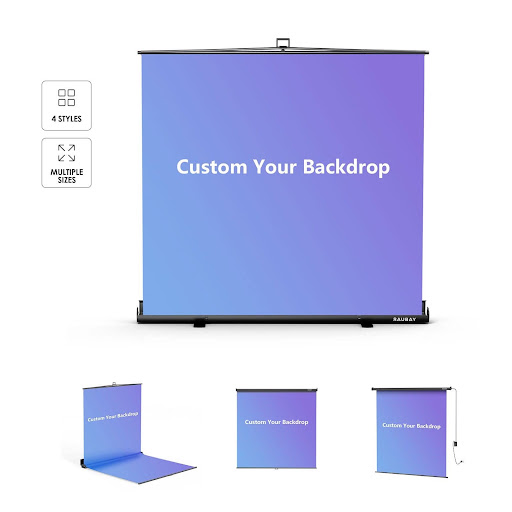
Stock backdrops solved a real problem for a long time. They gave photographers a fast way to add a controlled surface behind a subject without renting a location or building a set. But as brands ask for more consistent visual identities and portrait clients want images that feel personal, the generic muslin roll is starting to look like a compromise. A backdrop that could be anything is often exactly nothing to the eye of a viewer who scrolls past hundreds of similar images every day.
This article looks at what changes when you commission a backdrop built around a specific shoot rather than pulling something safe from the closet. We will cover the practical reasons the option has become affordable, the creative doors it opens, and the checks worth doing before you hand a file to a printer. If you have been hesitating on the switch, the following sections should make the decision clearer.
What Actually Sits Behind the Word Custom
Custom in this context does not mean expensive one-off canvas paintings. Modern printing on vinyl, polyester, and heavyweight paper lets studios produce a tailored surface at prices close to premium stock rolls. You supply artwork, a texture reference, or even a photograph of an existing location, and the printer outputs it at the exact dimensions your set calls for. The result reads on camera as a coherent environment rather than a piece of cloth.
The shift matters because clients now shop for photographers using image feeds. When your portfolio shows the same three grey seamless backgrounds behind different people, it flattens the story you are trying to tell. Well-chosen custom photography backdrops let each series feel deliberate, which is exactly what a paying client wants to see before they book.
Materials That Match the Shot
Different jobs want different surfaces. Fabric backdrops absorb light and hold color without hot spots, which suits portrait work and video where reflections would betray the illusion. Vinyl carries fine detail and holds up to floor use for full-length shots. Heavyweight matte paper prints excel for product photography, where a subtle textured surface reads as a real environment without pulling focus. Choose the material based on what will sit in front of it, not just on price.
Design Choices That Elevate the Frame
The design work is where most first-time buyers get stuck, so start with restraint. A backdrop that competes with the subject rarely wins. Soft, low-contrast patterns or textured solids tend to serve portraits better than photographic scenes, because the eye keeps returning to the face. If a client wants their brand color behind them, print it as a subtly gradient wash rather than a flat panel, which will read as more three-dimensional under studio lighting.
Scale is another quiet decision. Textures printed at real-world size, such as concrete grain or wood plank widths, will feel natural when the camera is a few meters away. Textures printed larger than life read as artistic but can strain believability. If the goal is to fool the viewer into thinking the subject is somewhere specific, keep proportions faithful. If the goal is a clearly stylized studio look, exaggerate freely.
Color Management Between Screen and Print
The number one avoidable disappointment is color drift between the file on your screen and the print that arrives. Ask the printer for their color profile and soft-proof your artwork with it before sending. Order a small sample swatch of the exact material with your key colors on it. This inexpensive step catches magenta shifts or muddied blues that would otherwise ruin the final backdrop. Reprints cost far more than a proof.
Where Custom Prints Pay Off Most
Brand campaigns benefit most obviously, since a custom surface can carry logos, brand textures, or thematic patterns without needing to be added later in post. But personal projects gain too. A family portrait against a subtle scene from a meaningful location, a musician photographed in front of album artwork, or a corporate headshot series unified by a signature texture, each turns a routine session into something that feels considered.
The economics tilt further in your favor when you reuse backdrops. A well-made custom print holds up to dozens of shoots when stored correctly. Roll it rather than fold it, keep it away from direct sunlight in storage, and gently spot clean any marks with a soft cloth. Studios that treat their prints as long-term investments, as Raubay recommends to its customers, generally get years of use before commissioning replacements.
Working with Your Printer
Treat the printer as a collaborator rather than a vendor. Share the lighting you plan to use, the shooting distance, and the final crop ratios. A good print house will suggest resolution and material combinations that hold up under those specific conditions. If you are printing artwork from a designer, loop that designer into the conversation early so the file can be built at the correct size and bleed rather than upscaled at the last moment.
Common Pitfalls Before You Commit
Beginners often order backdrops that are too small. The subject blocks half the surface, and any camera movement reveals the edge. Measure your typical shooting setup, add a margin for reframe room, and print larger than you think you need. It costs less to trim excess than to reshoot with a different setup.
Another common trap is designing for a single hero shot without thinking about lighting flexibility. A backdrop featuring a bright window pattern locks you into matching that direction of light. A more neutral base with directional variation gives you room to adjust when the client wants a second look from the same session. Design with tomorrow’s revisions in mind, not just today’s brief.
Make Your Background Work as Hard as Your Subject
A backdrop is not decoration. It is the second most important element in most photographs after the subject, and it deserves the same intention behind its choice. Moving from stock to custom prints is less about status and more about aligning what shows up in the frame with what the shoot is trying to say. Start with one thoughtful design tied to a real project, learn what the material does under your usual lights, and build a small library from there. Within a few commissions you will find your portfolio reads more coherently, and your clients will notice long before they can name why.