Some of the most powerful tattoos in the world are a single word. Not a sentence. Not a quote. One word. And the entire emotional and visual weight of the tattoo rests entirely on two things: the word itself, and the font it’s set in.
Single-word minimalist tattoos are simultaneously the simplest and the most demanding font choices in tattooing. This guide explains why — and shows you how a tattoo font generator helps you find the perfect font for a one-word tattoo that carries real impact.
Why Single-Word Tattoos Are So Demanding
When a tattoo contains multiple elements — an image, a date, a phrase — the visual complexity distributes attention. No single element has to carry everything.
A single-word tattoo has no distribution. Every aspect of the piece — size, placement, font, color — focuses entirely on that one word. The font carries 100% of the visual work.
This is demanding because there’s nowhere to hide. A font choice that’s merely acceptable in a complex piece becomes obviously wrong when it’s the only thing in the tattoo. And a font choice that’s truly right becomes extraordinarily powerful precisely because of that singular focus.
The Art of Minimalist Tattoo Typography
Minimalism in typography doesn’t mean using plain or boring fonts. It means choosing fonts with such precision and clarity that nothing needs to be added. The font itself carries all the personality the design needs.
True minimalist tattoo typography has these qualities:
Every letterform is intentional. In a single-word minimalist tattoo, every curve, every stroke terminal, every letter connection is visible and significant. There are no secondary elements to draw attention away from them.
Negative space is designed, not accidental. The space around and between the letters is as considered as the letters themselves. Good minimalist typography uses negative space actively.
Scale is calibrated precisely. A minimalist tattoo at the wrong scale loses its impact entirely. Too small and it disappears. Too large and it loses its understated quality.
The font has genuine character. Minimalism doesn’t mean genericness. The best single-word minimalist tattoos use fonts with real personality — just expressed simply.
Font Styles for Single-Word Minimalist Tattoos
Fine-Line Script Delicate, flowing, and intimate. A fine-line script for a single word feels like a whispered statement — personal and refined. Best for words carrying tenderness, love, or quiet strength.
Clean Geometric Sans-Serif Modern, precise, and confident. Clean geometric letterforms carry a sense of order and intention. Best for words about clarity, strength, or conviction.
Elegant Serif Timeless and dignified. A single word in a beautifully designed serif font carries classical weight. Best for words with philosophical weight or historical resonance.
Single-Weight Calligraphy Calligraphy with consistent stroke weight — no dramatic thick-thin contrast — gives a handwritten quality without the visual complexity of traditional calligraphy. Intimate and personal without being fragile.
Condensed or Extended Letterforms Unusually narrow or wide letterforms create strong visual personality while maintaining minimalist clarity. A single word in condensed or extended lettering reads with a specific architectural quality.
Common Single-Word Tattoo Mistakes
Choosing a font because it looks good in the alphabet, not in your actual word. A font might look beautiful displaying all twenty-six letters. But your specific word — with its particular combination of letters — might not show that font’s best qualities. Always generate your actual word, not a sample alphabet.
Picking a font that was trendy when the tattoo was done. Minimalist tattoos especially suffer from dating to a specific cultural moment. Choose fonts with genuine timelessness rather than current design trends.
Incorrect scale. Single-word minimalist tattoos have a very specific window of correct scale. Test carefully at your intended size.
Poor placement for the font’s proportions. A very wide word in an extended font doesn’t work on a narrow placement. A short word in a bold font might feel too heavy for a delicate wrist placement. Consider the proportional relationship between word length, font width, and placement carefully.
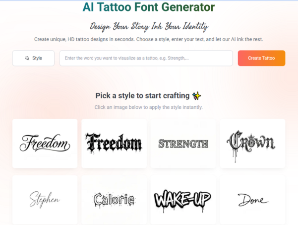
Using a Tattoo Font Generator for One-Word Designs
For single-word tattoos, the exploration process with a generator is particularly important — precisely because so much rides on the single font choice.
Generate extensively. The single-word context means you should generate more options, not fewer. Explore every style category. Produce thirty or forty variations of your single word. The right option exists somewhere in that space.
Evaluate each option on its own terms. Don’t compare options immediately. Look at each generated version of your word by itself and ask: does this font add meaning? Does it feel like the word was meant to look this way?
Test unusual combinations. The tattoo font generator will expose you to styles you wouldn’t have considered otherwise. Some of the strongest single-word tattoo fonts are not the obvious choices — they’re unexpected combinations of style and weight that create something memorable.
Scale down and test. Single-word minimalist tattoos are often small. Test your favorite options at exactly the scale you intend. The fine-line script that looks beautiful at display size might disappear at three centimeters. The geometric sans-serif that seems too plain at display size might look perfectly crisp and intentional at small scale.
Final Thoughts
A single word. One font. A lifetime of wearing it. The minimalist tattoo demands the most precise font choice of any lettering style — and rewards that precision with extraordinary visual power.
Use an AI tattoo font generator to explore widely, generate your actual word in dozens of variations, test at scale, and find the option that makes that single word feel inevitable.
When the font is exactly right for a single-word tattoo, the piece needs nothing else.