

Color theory is a fundamental concept in art and design that helps individuals understand how colors interact and the emotional responses they elicit. The foundation of color theory is the color wheel, a visual representation of colors arranged in a circle. This wheel is divided into three primary sections: primary colors, secondary colors, and tertiary colors. The primary colors—red, blue, and yellow—cannot be created by mixing other colors. When combined, these primary hues generate secondary colors: green (blue + yellow), orange (red + yellow), and purple (red + blue). Tertiary colors emerge from mixing a primary color with a secondary one, resulting in hues like red-orange or blue-green.
Color classification extends beyond mere mixing; colors are also categorized as warm or cool. Warm colors, such as red, orange, and yellow, evoke feelings of energy, passion, and warmth, making them ideal for creating inviting spaces. Conversely, cool colors like blue, green, and purple convey calmness and serenity, promoting relaxation and tranquility. Understanding the warmth or coolness of colors is essential for selecting paint hues that align with the desired mood of a room.
Color theory is not only about aesthetics but also the psychology behind colors and their impact on emotions and behaviors. Colors can significantly influence mood and perception in one’s environment. For example, blue is often associated with productivity and calmness, while yellow can stimulate creativity and optimism. By incorporating color theory principles, homeowners can create harmonious color schemes that enhance their living spaces’ aesthetic appeal and emotional undertones.
Assessing Your Space
When embarking on the journey of selecting paint colors for your home, one of the crucial first steps is assessing your space. This assessment involves taking a close look at several key factors that will significantly impact your color choice.
Firstly, consider the natural light that seeps into each room throughout the day. Bright, well-lit rooms tend to allow colors to appear more vibrant and lively, while spaces with limited natural light can make shades seem dull or muted. Take note of how the light shifts as the day progresses, as this can influence the feel of the room. South-facing rooms receive more direct sunlight and can handle warmer colors, while north-facing spaces may benefit from cooler, airy tones.
Room size is another critical aspect to evaluate. Larger spaces may easily accommodate bold or darker hues, fostering warmth and intimacy. In contrast, smaller rooms can sometimes feel cramped with such choices; thus, opting for lighter, softer colors can create an illusion of space, making the room feel bigger and airier. Additionally, consider the existing furniture and decor within the space. Coordinating your paint color with upholstered pieces, flooring, and artwork can result in a harmonious and cohesive environment.
Furthermore, it’s essential to analyze the ambiance you wish to cultivate in each area. For instance, tranquil colors like soft blues and greens can foster a calm atmosphere in bedrooms or bathrooms, while energizing hues may suit a creative workspace. Ultimately, the combination of these factors will guide you in selecting paint colors that not only beautify but also enhance the overall feel of your home, establishing a meaningful connection between the colors and the experiences they foster in your living spaces.
Determining Your Style
Choosing the right paint colors for your home begins with an essential step: determining your decorating style. Understanding your personal aesthetic can significantly influence your color choices and create a cohesive atmosphere throughout your living space. Various styles exist, such as modern, traditional, farmhouse, and eclectic, each with unique characteristics and color palettes.
If your preference leans towards a modern style, you might gravitate towards bold, minimalistic colors such as whites, blacks, and grays. These hues create a sleek and contemporary environment while allowing for accent colors to pop. Conversely, traditional decor often calls for rich and warm tones like deep reds, golds, and soft greens, which can impart a sense of elegance and comfort to your interiors.
Should you favor the farmhouse style, you may find yourself drawn to softer, muted colors like pale blues, creamy whites, or earthy greens. These colors evoke a cozy and inviting atmosphere reminiscent of rustic charm. On the other hand, if your taste is more eclectic, you can have fun mixing and matching colors from various palettes. This style often embraces vibrant shades and unexpected combinations, celebrating individuality and creativity.
Incorporating personal elements into your color selection fosters a unique space that reflects your personality. Consider how different colors make you feel and how they correlate with your daily activities. For a harmonious blend, you may borrow hues from your favorite accessories, textiles, or art pieces to anchor your color scheme.
Ultimately, by defining your style and embracing the associated color palettes, you can craft a home that resonates with your tastes while also allowing for versatility. This foundational step will guide you as you experiment with different colors to achieve the desired ambiance in your space.
Choosing a Color Palette
Creating a cohesive color palette for your home is essential for achieving a harmonious aesthetic that enhances the ambiance of your living spaces. The process begins with understanding different approaches to generating a color scheme, allowing you to find the most suitable option for your personal taste and the architectural characteristics of your home.
A popular method for color selection is the monochromatic approach. This technique involves choosing variations of a single color. By selecting different shades, tints, and tones of one hue, you can create a soothing and elegant environment. This method is particularly effective in rooms where a serene atmosphere is desired, such as bedrooms or reading nooks.
Another method is the use of complementary colors. This approach involves using colors that are opposite each other on the color wheel, such as blue and orange, or red and green. By integrating complementary colors into your home, you can create dynamic and eye-catching contrasts that add visual interest. However, it is crucial to balance these colors carefully to avoid overwhelming or clashing combinations.
Additionally, analogous colors can be employed to create a more cohesive and cohesive look. This method involves choosing colors that are adjacent to each other on the color wheel, such as blue, teal, and green. Using analogous colors can result in a serene and harmonious environment, making it an excellent choice for common areas where relaxation is key.
Finally, selecting accent colors plays a pivotal role in enhancing your overall palette. Accent colors can bring life to neutral spaces and serve as powerful focal points that draw attention. Incorporating vibrant accents into your design can transform a mundane palette into something truly captivating.
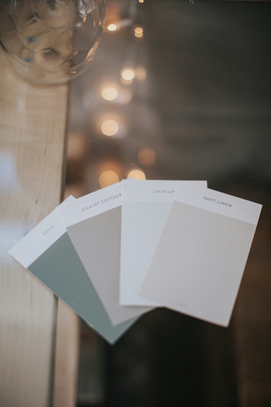
Testing Paint Samples
Before making a final decision on paint colors for your home, it is imperative to test samples thoroughly. This initial step ensures that the chosen colors will harmoniously integrate into your space. The first approach is to apply paint samples directly on the walls in the areas you are considering. Utilize large sample swatches, ideally 2×3 feet, to accurately gauge how the color interacts with existing furnishings and decor.
When testing the samples, do not limit yourself to a single wall or corner. Instead, consider applying the paint to multiple walls in the room to observe how the color shifts in various settings. Every room possesses distinct elements—such as furniture, fabrics, and natural light—that affect the perception of color. Consequently, it is crucial to assess the chosen paint in the context of the whole room.
Another vital aspect to keep in mind is the undertones of your paint color. Undertones can significantly shift the appearance of a color, especially when juxtaposed with other elements in the room. For example, a gray paint may exhibit warm undertones with a hint of beige, or it may lean towards a cooler blue hue. Paying keen attention to these subtleties will aid in selecting a color that complements the overall aesthetic of your home.
Furthermore, lighting plays a pivotal role in how paint colors are perceived. Colors will look different at various times of the day, influenced by natural light or artificial lighting. It is advisable to observe your color samples during different times of the day to ensure the chosen color remains appealing under various conditions. This practice will help solidify your choice, leading to a more satisfying and cohesive home environment that aligns with your vision.
Considering Mood and Function
When selecting paint colors for your home, it is vital to consider their emotional impact and how they relate to the function of each space. Each color evokes specific feelings and can significantly influence the atmosphere of a room. For instance, calming colors like soft blues and greens are ideal for bedrooms, where relaxation and tranquility is the primary goal. These hues promote serenity and can contribute to better sleep quality.
In contrast, workout areas are enhanced by energizing colors such as vibrant red or lively orange. These colors stimulate the senses and can boost motivation, making them perfect for spaces dedicated to physical activity. The right paint color can create an uplifting environment, helping individuals to feel invigorated during their exercise routines.
Living rooms often serve as a gathering space, so it is essential to choose colors that create an inviting and warm atmosphere. Shades like warm taupe, soft yellows, and neutral grays can help in achieving a welcoming effect that encourages social interaction and comfort. These colors foster a sense of familiarity, making it easier for guests to feel at home during their visits.
Additionally, it’s important to consider the natural light in each room, as it can alter the perception of color. Colors may appear differently at various times of the day based on the quality of light, which can affect the overall mood and functionality of a space. Careful coordination between the intended use of a room and its color scheme will yield aesthetically pleasing and effective living spaces.
Using Trends Wisely
In the realm of interior design, staying attuned to current paint color trends can provide fresh inspiration while ensuring your home maintains a contemporary aesthetic. As we step into this year, popular hues include soft pastels, rich jewel tones, and earthy neutrals, each commanding attention in various spaces. However, it is crucial to utilize these trends judiciously. A balance between embracing the latest colors and honoring your personal style can lead to a harmonious home environment that feels both modern and timeless.
When considering color trends, it is wise to start with a color palette that resonates with your existing decor and overall ambiance of your home. For instance, incorporating trendy shades like deep emerald green or pale sage can invigorate a space, but making them the focal point requires careful thought. Accent walls or smaller surfaces, such as trim and cabinetry, present an excellent opportunity to introduce trendy colors without overwhelming your living areas.
Moreover, timeless colors, such as whites, grays, and beiges, can serve as a backdrop that allows trendy accents to shine without dominating the space. This approach ensures that your home retains cohesion while allowing for flexibility as trends evolve. Selecting versatile shades can keep your environment feeling fresh and relevant without necessitating a complete overhaul every few years.
Ultimately, integrating current trends into your home’s color scheme should not sacrifice your personal style. Focus on how each color makes you feel and how it complements your lifestyle. Curate a selection of trending colors that resonate with you and blend seamlessly with your established aesthetic, ensuring your home remains a true reflection of your individuality.
Seeking Professional Help
Choosing the right paint colors for your home can be a challenging task, especially with the vast array of options available. While many homeowners feel confident making these decisions on their own, there are instances where seeking professional help can be highly beneficial. Color consultants and interior designers possess an extensive understanding of color theory and design principles, making them valuable resources in the decision-making process.
A professional color consultant can provide tailored advice based on your specific needs, preferences, and the unique characteristics of your living space. They can assist in harmonizing colors with existing furnishings and decor, ensuring that the selected palette enhances the overall aesthetic of your home. Additionally, color consultants are adept at considering factors such as lighting, room function, and personal style, which can influence how colors appear in a given setting.
Interior designers, on the other hand, offer a more comprehensive service that spans beyond just color selection. When you hire an interior designer, you gain access to their expertise in space planning, furnishings, and decorative elements. This holistic approach allows them to create a cohesive design that integrates color choices into a larger vision for your home. If you are undertaking a significant renovation or redesign, collaborating with an interior designer can streamline the process, ensuring that paint colors effectively complement the overall design intent.
When considering whether to hire a professional, reflect on your comfort level with design decisions and the time you can invest in the process. Professionals often charge for their services, so it is crucial to weigh the benefits against your budget. Regardless of the path you choose, enlisting the guidance of experienced professionals can help ease the burden of selecting paint colors, allowing you to achieve a harmonious and beautifully designed living space.
Finalizing Your Choices and Execution
As you approach the final stages of selecting paint colors for your home, it is essential to ensure that your choices align with your design vision. Start by preparing the room where you plan to paint. Clear the space of furniture and cover any remaining items with drop cloths to protect them from paint splatters. Removing outlet covers and ensuring the surfaces are clean will further enhance the final appearance.
Choosing the right finish is another crucial step in the painting process. Different finishes, such as matte, eggshell, satin, and glossy, can significantly affect the overall look of a room. For high-traffic areas such as hallways or kitchens, a satin or semi-gloss finish may be advisable due to their durability and ease of cleaning. Conversely, matte finishes are often suitable for ceilings and low-traffic areas, providing a soft, elegant look.
If you are considering hiring professional painters, several tips can ease the process. Start by seeking recommendations from friends, family, or online forums to find reliable local professionals. Review their portfolios to assess their work quality and gauge their experience level. Furthermore, it’s sensible to request estimates from at least three contractors. This allows you to compare services and costs. Ensure that each estimate details the scope of work, materials used, and timelines to avoid any misunderstandings later.
Before the actual painting begins, conduct a thorough walk-through with your hired team to clarify expectations and address any concerns. A well-prepared space and clear communication will lead to a smoother painting experience, ultimately contributing to a successful transformation of your home. Ensuring you have selected the perfect paint color and finish will enhance both the aesthetics and comfort of your living spaces.