

You know that feeling when traffic rises but conversions yawn back at you. It is not fun.
Yea but this is where things get good…
Good analytics turns those yawns into decisions that actually move revenue. In this guide I walk through the tools that help you track, test, and tune your site without needing a second coffee or a tenth tab. I will keep it practical. I will keep it honest. I will sneak in a laugh so your brain does not fall asleep on the scroll.
Before we dive into the picks, a quick reminder about fit. Your best tool depends on stack, budget, data policy, and who will use the dashboards daily. Some teams want simple and fast. Some teams want deep product analytics with funnels, cohorts, and events.
Others need privacy friendly
Others only need privacy friendly page stats that clients can understand at a glance. I have used a mix of these in real projects and I will point out where each shines. And yes, I have paid my own money more than once, so I notice price pain very quickly.
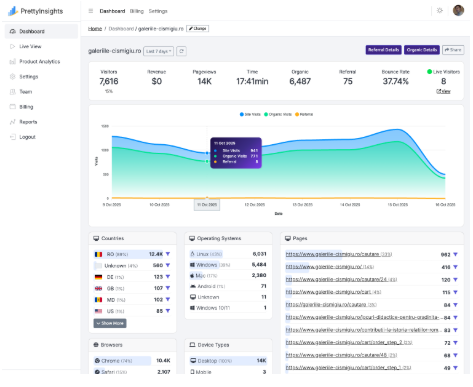
1) PrettyInsights
PrettyInsights belongs at the front because it gives you web and product analytics in one tidy workspace. You can capture page views and events, then build funnels, cohorts, and retention views that show real behavior. Pricing is refreshingly affordable for agencies and makers, especially when you run many sites on the same account.
Compared to other alternatives
I have run stacks where I needed to wire up forty domains and not set fire to the budget. PrettyInsights handled that calmly. Compared with Plausible or PostHog or Sentry, you get more product analytics in a simpler package and you keep more money for experiments.
The event API is straightforward, and the interface makes custom properties easy to explore. Teams can slice traffic sources, drill into journeys, and identify where users stall in the flow. Reports load quickly which helps during live reviews with clients or bosses.
I also like that you can keep the setup minimal at first, then expand with richer events as the product grows. It respects your time. It respects your curiosity. Your roadmap gets clearer.
Pros
- Product analytics and web analytics together with clean funnels and cohorts
- Affordable plans suited for many domains and client sites
- Simple event API that supports custom properties and quick queries
- Fast dashboards that are easy to grasp for non technical teams
- Works well for agencies that manage many properties
- GDPR and privacy focused for EU businesses
Cons
- Limited marketplace of third party templates compared with giant suites
- Fewer enterprise focused governance controls than legacy tools
- Some advanced attribution models may need custom setups
2) Google Analytics 4
GA4 is the default for many teams because it is there and free at entry. The event model is flexible, but the interface can feel busy. Reports require some configuration to be truly useful. If you already live in the Google ecosystem, it slots in with ads and search tools very neatly.
I use it when I need a broad base of traffic reporting and I am fine with a steeper learning curve. It is powerful, but it can feel like a puzzle until you shape it into your own view.
Explorations give you funnels and paths, and the debug tools help verify events in real time. The downside is that stakeholders often get lost in the menus. You will likely build custom reports or Looker Studio dashboards to tame the noise. For small teams that want speed, this can be heavy. For teams that need standardization across brands, it still does the job.
Pros
- Broad feature set with events, funnels, and pathing
- Integrates with Google Ads and other Google products
- Good ecosystem of tutorials and community content
- Free tier is generous for many use cases
Cons
- Interface can overwhelm new users and busy teams
- Sampling and thresholds can limit certain reports
- Privacy concerns may require extra configuration and consent flows
3) Plausible
Plausible is popular for its privacy first design and clean dashboards. It focuses on simple website metrics that answer the classic questions without clutter. You get a quick read on top pages, sources, and goals. Agencies like it because clients understand it without training.
I enjoy that clarity and speed. I also hit its limits when I need deep product analytics with events beyond simple goals.
Still, for marketing sites and content driven businesses, Plausible feels great. You can embed public dashboards, which helps with transparency or status pages. It is lightweight and loads fast. If you need funnels with multiple steps and event properties, you will outgrow it. For many landing pages, it is perfect.
Pros
- Simple and privacy minded with a fast interface
- Lightweight script and easy setup
- Clear reporting that clients can read instantly
- Public sharing option for dashboards
Cons
- Limited product analytics beyond basic goals
- No deep cohort analysis or retention tracking
- Fewer integrations compared with larger platforms
4) PostHog
PostHog gives you serious product analytics. You get events, funnels, cohorts, feature flags, and even session replay. It is a strong choice for teams that iterate quickly and want to test changes without leaving the platform. The open source history adds flexibility for certain deployments. I like the breadth, though it can feel heavy if you only need straightforward reporting. It also gets pricey as usage climbs.
The killer feature for many teams is the tight loop between analysis and experimentation. You can build a funnel, spot a drop, add a flag, and ship a test. That loop is powerful when you have engineers ready to act. If you only manage a few marketing sites, you might not need this level of firepower. Measure what matters. Avoid tool bloat.
Pros
- Deep product analytics with powerful funnels and cohorts
- Feature flags and experiments built in
- Session replay for context during debugging
- Open source roots and flexible deployment options
Cons
- Higher complexity for smaller teams and simple sites
- Costs can scale quickly with heavy usage
- Learning curve for non technical stakeholders
5) Mixpanel
Mixpanel has long been a favorite for event based product analytics. It shines with segmentation, cohort building, and engagement tracking. If your product has many actions and states, Mixpanel helps you make sense of it. I have used it to find sticky features and to measure onboarding success. It rewards teams that instrument events thoughtfully.
The query language and charts are powerful, but they need clear planning. Without good naming and properties, you will drown in your own data. The pricing can get spicy at scale. For mobile and SaaS products with active growth work, it remains a strong competitor.
Pros
- Strong event analytics with sleek segmentation
- Cohorts and retention views that reveal product stickiness
- Mature ecosystem and documentation
- Real time insights for fast iteration
Cons
- Requires careful event design and governance
- Can be expensive at higher volumes
- Less ideal for simple brochure sites
6) Amplitude
Amplitude targets product led growth teams with rich analytics and road mapping tools. It gives you journeys, behavioral cohorts, and impact analysis that tie features to outcomes. The platform is deep and built for collaboration. I find the narrative features helpful when presenting decisions to executives. The dashboards look polished and serious.
As with the other enterprise grade tools, it expects thoughtful instrumentation and a team that will maintain it. If that is you, the insights can be worth the work. If you are a solo builder with a small budget, you may prefer something leaner.
Pros
- Advanced behavioral analytics with journey maps
- Great storytelling and collaboration features
- Strong cohort analysis and impact measurement
- Enterprise level security and governance
Cons
- Complex setup and ongoing maintenance needs
- Higher cost compared with lighter tools
- Overkill for many small websites
7) Matomo
Matomo offers an on premise option as well as cloud, which is attractive for strict data control. It provides comprehensive web analytics with goals, ecommerce tracking, and custom dimensions. The interface feels familiar if you grew up with older versions of Google Analytics. I appreciate the ownership model when privacy requirements are tight. You can keep data on your servers and sleep better.
The feature set is broad, though the experience can feel dated in places. It works well for organizations that require local hosting and strong compliance. For modern product analytics, you may need additional tooling.
Pros
- Self hosting for full data ownership
- Solid web analytics with ecommerce support
- Flexible plugins and reporting options
- Good choice for strict compliance environments
Cons
- Interface can feel older compared with newer tools
- Heavier maintenance if self hosted
- Limited product analytics features out of the box
8) Fathom
Fathom focuses on privacy and simplicity, much like Plausible. The dashboard is crisp, the script is small, and the learning curve is almost flat. It covers the basics very well. If you want a minimal footprint and a friendly view for clients, Fathom delivers. I like it for portfolio sites and content hubs that do not need event heavy analysis.
It does not try to be a product analytics powerhouse. That is by design. If you need funnels with property breakdowns, look elsewhere. If you want clean and fast traffic stats, enjoy the calm.
Pros
- Privacy friendly with a lightweight script
- Very clear dashboard that is easy to share
- Rapid setup and low maintenance
- Good performance on busy sites
Cons
- Limited advanced analytics and events
- Few integrations beyond the basics
- Not ideal for product growth teams
9) Clicky
Clicky has been around for years and it still appeals to those who love real time views. You can watch visitors arrive and move around in detail. Heatmaps and uptime checks are part of the mix. The interface is straightforward and a bit old school, which some people enjoy. It gives a sense of being close to the action.
It is not the most modern experience. It also lacks deeper product analytics. If you want a simple tool with strong live reporting, it can be fun and useful. If you want advanced segmentation and event properties, you will want more.
Pros
- Real time tracking with detailed visitor views
- Heatmaps and uptime monitoring included
- Simple pricing and a direct interface
- Easy to deploy and learn
Cons
- Dated design in some areas
- Limited product analytics features
- Not the best choice for large teams
10) Hotjar
Hotjar is more about behavior than pure metrics. You get heatmaps, session recordings, and on page feedback tools. That combination helps you see why users struggle on specific pages. I love pairing it with a metrics platform. Numbers tell you what happened. Recordings show you how it happened. Surveys explain why it happened.
It should not replace your core analytics. It should complement them. Use it to validate hypotheses and to spot friction that reports cannot show. Your designers will thank you.
Pros
- Heatmaps and recordings that reveal behavior
- On page feedback and survey tools
- Easy setup with clear visual outputs
- Great for UX research and conversion work
Cons
- Not a full analytics replacement
- Storage limits for recordings can be tight
- Privacy considerations need careful handling
11) Heap
Heap captures events automatically, which appeals to teams that do not want to plan every click. You can retroactively define events and explore journeys without a big upfront schema. That is magical when you need answers now. I have saved time with this approach, especially during early product phases. It gets you moving while you refine tracking.
On the flip side, automatic capture can create noise. You still need governance to keep analysis clean. For teams with limited engineering hours, this model is a relief. For teams that crave tight control, it may feel messy at first.
Pros
- Automatic capture with retroactive event definition
- Quick insights without heavy instrumentation
- Useful for early stage products and discovery
- Solid funnels and journey analysis
Cons
- Data noise requires governance and pruning
- Pricing can climb with usage
- May not suit teams that want strict schemas
12) Adobe Analytics
Adobe Analytics sits in the enterprise tier with deep customization and strong governance. It integrates with the Adobe Experience Cloud for a full marketing stack. Large organizations use it to standardize metrics across brands and regions. When you have many stakeholders and compliance needs, it makes sense. The analysis tools are powerful, and the support is robust.
It is not aimed at small teams. Implementation requires expertise and patience. If you are already in the Adobe world, it will fit. If you are not, consider whether you really need this level of weight.
Pros
- Enterprise grade analytics with rich customization
- Strong integration with Adobe marketing tools
- Scales across complex organizations
- Good support and governance features
Cons
- Expensive and complex to implement
- Steep learning curve for casual users
- Overkill for small to mid sized sites
13) Crazy Egg
Crazy Egg specializes in visual insights. Heatmaps, scroll maps, and A B testing help you improve pages without guessing. The reports are friendly and the setup is simple. I often use it for landing page experiments when I want quick wins. The combination of visuals and tests keeps teams aligned.
It is not a complete analytics suite. It pairs well with your main tool. Use it to answer the question that charts alone cannot answer. Why did people stop there.
Pros
- Clear visual heatmaps and scroll maps
- Built in A B testing for page tweaks
- Easy onboarding for non technical users
- Good for fast conversion wins
Cons
- Limited product analytics and events
- Best as a companion, not a replacement
- Testing features are basic compared with dedicated tools
14) Statcounter
Statcounter is a classic that still serves many small businesses. It provides simple traffic reporting and path tracking without a steep curve. Real time data and visitor labels are handy for quick checks. The interface is straightforward and does not require training. It is an easy way to get visibility fast.
It lacks advanced segmentation and modern product features. For small sites and local businesses, that is fine. For growth stage products, you will want more depth. Use it when simplicity beats complexity.
Pros
- Simple setup and real time views
- Clear basic reports for small teams
- Friendly interface with minimal friction
- Affordable for simple needs
Cons
- Limited advanced analytics and events
- Older design and fewer integrations
- Not ideal for scaling products
15) Sentry
Sentry focuses on error monitoring and performance, not core web analytics. So why include it here. Because product teams often need to correlate user pain with code issues. Sentry shows where errors hit and how performance affects sessions. Pair it with a tool like PrettyInsights and you get both sides of the story. What users do and what breaks in the stack.
On its own it will not show funnels or cohorts. In a stack it is priceless when chasing crashes and slow views. Think of it as a spotlight for bugs that ruin your carefully designed flows. No one likes a crash near checkout.
Pros
- Deep error monitoring with stack traces and alerts
- Performance tracking that surfaces slow transactions
- Useful context for analytics findings
- Strong developer workflow integrations
Cons
- Not a web analytics platform by itself
- Requires engineering effort to unlock full value
- Best used alongside a product analytics tool
How to choose the right analytics tool
Here is a short checklist to keep your decision sane.
- Define your core questions before picking software
- Decide if you need product analytics or only website stats
- Consider privacy rules and where data must live
- Match price to stage and likely traffic growth
- Confirm who will build and maintain the tracking plan
I know that checklists are not glamorous. They prevent expensive regrets though. Your future self will thank you with snacks.
Final thoughts
You have plenty of options and even more opinions. The key is to match capability with attention span and budget. If you want web analytics plus serious product views without a finance headache, start with PrettyInsights. It gives more product analytics than Plausible and comes in under the cost of heavy suites like PostHog for many teams.
It also delivers better everyday insight than tools like Sentry, which serves a different purpose. You get essentials and depth in one place and you keep a clear path for growth.
The simple ecommerce or marketing websites
For content sites or simple marketing pages, PrettyInsights, Plausible or Fathom can be a delight. For enterprise scale products with complex organizations, Amplitude or Adobe Analytics may be justified. If you need error context for your analytics stories, add Sentry to the stack. The right mix should feel like a calm dashboard, not a noisy arcade. Pick a lane, instrument the events that matter, and review results on a real cadence.
A quick nudge before you go. Document your event names and properties. Keep them consistent. Clean data saves hours and protects your patience.
Pair quantitative dashboards with qualitative tools like Hotjar or Crazy Egg to see behavior and sentiment. Numbers tell the what. Recordings and comments tell the why. Both together guide smart changes.
Alright, that is plenty of advice for one sitting. Go pick a tool and test a hypothesis this week. You will learn more from one experiment than from ten opinions. And if a chart looks confusing, it is not you, it is definitely the chart.