



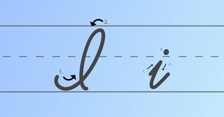
Learning how to write cursive I is a useful step toward developing smooth, connected handwriting. Although the letter looks simple, uppercase I and lowercase i use different movements, proportions, and connections. Lowercase cursive i is short and compact, while the capital I is taller and can look more decorative depending on the cursive handwriting style being used.
If you are learning cursive for school, improving your handwriting, practicing calligraphy, or simply wondering what I looks like in cursive, this guide covers both forms step by step.
You will learn how to write a capital I in cursive, how to form a lowercase cursive i, where to place the dot, how to connect i with other letters, and how to practice it naturally inside real words and names.
What Does I Look Like in Cursive?
The cursive letter I has two noticeably different forms:
Uppercase cursive I: ℐ or 𝓘
Lowercase cursive i: 𝒾 or 𝓲
The exact appearance can vary between handwriting systems, school methods, calligraphy styles, and digital script fonts.
A capital cursive I is usually tall and flowing. It may contain a loop, curve, or sweeping stroke that gives it a more decorative appearance than a printed capital I.
A lowercase cursive i is much simpler. It generally consists of a short rising stroke, a downward movement to the baseline, an exit stroke toward the next letter, and a dot placed above the body of the i.
The lowercase form is especially important because it appears frequently inside everyday words.
How to Write a Lowercase i in Cursive
For many beginners, the lowercase cursive i is easier to learn first.
Think of it as a short, smooth movement rather than a collection of separate lines.
Step 1: Start at the Baseline
Place your pencil or pen on the baseline.
Begin with a light upward stroke toward the middle writing line. The stroke should rise naturally rather than becoming completely vertical.
Step 2: Form the Short Stem
At the top of the small stroke, turn gently and move downward toward the baseline.
Keep the letter short.
A lowercase i should normally be approximately the same body height as nearby lowercase letters such as a, c, e, m, n, and u.
Step 3: Create the Exit Stroke
When the downward stroke reaches the baseline, curve upward and toward the right.
This is the connecting stroke.
It prepares your hand to move directly into the next letter when writing a word.
Step 4: Add the Dot
After forming the body of the i, place a small dot above it.
When writing a complete cursive word, many writers find it smoother to finish the connected word first and return afterward to dot the i.
For example, when writing:
invite
you can connect the main letter strokes first and then return to place the dot above the i.
This keeps the writing movement flowing.
How to Write an Uppercase I in Cursive
The uppercase cursive I is taller and often more decorative than lowercase i.
Capital cursive forms vary more between handwriting systems, so you may encounter slightly different versions. The important features are consistent height, smooth movement, and a recognizable capital form.
Step 1: Begin Near the Baseline
Start near the lower writing line and move upward with a controlled curved stroke.
Avoid pressing too hard. A relaxed stroke usually creates smoother curves.
Step 2: Rise Toward the Top Line
Carry the stroke toward capital-letter height.
The capital I should clearly stand taller than nearby lowercase letters.
Step 3: Form the Main Curve or Loop
Depending on the cursive style you are learning, create the characteristic upper curve or loop and guide the stroke downward.
Keep the motion continuous rather than building the letter from several disconnected pieces.
Step 4: Finish Smoothly
Complete the bottom curve or finishing stroke with enough space that the letter remains open and readable.
Some uppercase I styles naturally lead toward the next letter, while others are written separately before the following lowercase letter begins.
The most important goal is not decoration. It is creating a capital I that is balanced, consistent, and easy to recognize.
Capital I vs. Lowercase i in Cursive
Uppercase and lowercase cursive I serve different roles.
The capital I is mainly used at the beginning of names, sentences, titles, and the pronoun “I.” It reaches the full capital-letter height and usually contains larger curves.
The lowercase i appears inside words and is significantly shorter.
Compare these examples:
Capital I:
Iris
India
Isabella
Isaac
Imagine
Lowercase i:
smile
kind
winter
bright
pencil
Practicing both forms separately before combining them with other letters can make handwriting more consistent.
How to Connect Lowercase Cursive i
One of the most useful things about lowercase cursive i is its simple exit stroke.
After reaching the baseline, the letter curves upward toward the right. That movement becomes the beginning of the next connected letter.
Try these combinations slowly:
ia
ie
il
in
io
ir
is
it
Each combination teaches a slightly different transition.
For example, in moves from the exit of i into another short rounded letter.
The combination il changes direction more dramatically because the l rises much higher.
The combination ir teaches you to control spacing before beginning the shape of r.
Practicing letter pairs is often more useful than repeatedly writing an isolated i because cursive handwriting depends on connections.
Easy Words for Practicing Cursive I
Once you are comfortable with the letter by itself, practice it inside short words.
Start with:
ice
ink
ivy
idea
iris
Then try slightly longer examples:
inside
invite
island
image
inspire
For lowercase i in the middle of words, practice:
smile
shine
quiet
friend
window
little
bright
writing
These examples introduce different letters before and after i, helping you practice realistic cursive joins.
Unique Cursive I Practice Sentences
Full sentences help you move beyond isolated letter drills.
Try writing these slowly:
Ivy invited Iris inside.
This sentence gives you several uppercase and lowercase I forms in a short line.
Another useful example is:
Isla is writing an interesting idea.
Here you practice capital I, lowercase i at the beginning of words, and i inside longer words.
For a slightly more challenging exercise:
Isabella quietly finished writing her inspiring story.
This sentence combines several different connections involving i and encourages you to maintain consistent spacing across a longer line.
You can also create your own sentence around words beginning with I. Personalized practice is often more interesting than repeatedly copying the same alphabet row.
Names Beginning With Cursive I
Names are excellent for practicing uppercase cursive I because they combine a capital letter with connected lowercase letters.
Try:
Isabella
Isaac
Iris
Ivan
Ian
Imogen
Ingrid
Isla
Notice how the letter immediately following the uppercase I changes the movement of the word.
For example, Iris moves quickly into a compact r, while Isabella requires a smooth transition into s followed by several rounded letters.
Practicing names helps make the capital form feel natural rather than isolated.
Practice the Cursive I With Letter Families
Instead of writing only:
i i i i i
combine it with nearby letters:
ia ia ia ia
in in in in
im im im im
ir ir ir ir
it it it it
Then reverse the pattern:
mi mi mi mi
ni ni ni ni
ri ri ri ri
li li li li
This teaches your hand how to approach i from different letters as well as how to leave it.
That is important because a cursive letter can look slightly different depending on the letters surrounding it.
Common Mistakes When Writing Cursive I
The letter I is easy to recognize once written correctly, but several small mistakes can make handwriting look uneven.
Making Lowercase i Too Tall
Lowercase i belongs with short lowercase letters.
If its stem rises too high, the letter can begin to resemble an l.
Keep the body near the normal lowercase writing height.
Placing the Dot Too Far Away
The dot should sit reasonably above the i rather than drifting over another letter.
Poor dot placement becomes especially confusing in words containing several narrow strokes.
Making the Capital I Too Small
Uppercase I should clearly appear taller than the lowercase letters that follow it.
If the capital is almost the same height as lowercase letters, the beginning of a name or sentence may look unclear.
Lifting the Pen Too Often
Cursive is designed around flowing movement.
Avoid treating every curve as a separate printed stroke. Try to complete the main body of each letter smoothly.
Writing Too Fast
Speed comes after control.
Writing quickly before you understand the movement can produce uneven loops, misplaced dots, and inconsistent slant.
Slow practice usually develops better muscle memory.
How to Improve Your Cursive I
Improvement does not require writing hundreds of identical letters at once.
A short structured practice routine can be more useful.
Begin with one line of uppercase I:
I I I I I
Then write one line of lowercase i:
i i i i i
Next, practice connected combinations:
in it is ir il
Then write three short words:
ice iris idea
Finish with a sentence:
Iris is inside.
This sequence moves from simple letter formation to natural handwriting.
Repeat it while paying attention to height, spacing, slant, connections, and dot placement.
Cursive I for Beginners
If you are completely new to cursive handwriting, focus on shape before speed.
Use lined paper so you can clearly see:
- the baseline,
- lowercase letter height,
- capital letter height,
- spacing between words.
Write slowly enough that you can control every movement.
Once the letter looks consistent, gradually increase your writing speed.
Your cursive I does not need to look exactly like a digital font. Natural handwriting varies from person to person. The goal is to create a recognizable letter with smooth and consistent movement.
Cursive I Copy and Paste
If you are looking for a digital cursive I rather than handwriting practice, script-style Unicode characters can provide decorative versions that can be copied for compatible platforms.
Examples include:
ℐ – script capital I
𝒾 – script lowercase i
𝓘 – bold script capital I
𝓲 – bold script lowercase i
These characters are different from physically writing cursive with a pen. They are digital characters designed to resemble script lettering.
They can be useful for names, short decorative text, profiles, and creative formatting where the platform supports them.
Cursive I in Words
The best way to become comfortable with the letter is to see it working naturally inside words.
Here are several groups you can practice.
Words Beginning With I
ice
idea
image
inch
inside
invite
island
item
ivy
Words With i in the Middle
smile
shine
quiet
family
winter
pencil
little
friend
bright
Words Ending With i
English has fewer everyday words ending in i, but names and borrowed words can still provide useful practice, such as:
Hawaii
sushi
taxi
safari
These examples expose your handwriting to different incoming and outgoing strokes.
Frequently Asked Questions About Cursive I
How do you write a lowercase i in cursive?
Begin at the baseline, rise toward the middle line, move back down to the baseline, and finish with an exit stroke toward the right. Add the dot above the letter after forming the main stroke.
How do you write a capital I in cursive?
A capital cursive I is usually formed with a tall sweeping stroke and one or more smooth curves or loops. Its exact shape can vary between cursive handwriting styles.
What does cursive look like?
A lowercase cursive i is a small connected stroke with a dot above it. Uppercase cursive I is taller and generally more decorative.
Do you dot the i immediately in cursive?
You can, but when writing a connected word it is often smoother to complete the word first and return to dot the i afterward.
Is uppercase cursive I always written the same way?
No. Capital cursive letters can vary considerably among handwriting systems and personal writing styles. A clear, consistent form is more important than copying one decorative variation exactly.
How can I practice cursive I?
Practice the uppercase and lowercase forms separately, then move to pairs such as in, it, and ir. After that, write words such as ice, idea, iris, inside, and invite.
Practice Cursive I With Confidence
The cursive I may be a small part of the alphabet, but learning it properly improves several important handwriting skills at once.
Lowercase i teaches controlled short strokes, smooth connections, consistent letter height, and accurate dot placement. Uppercase I helps you practice taller movements, curves, and capital-letter proportions.
Begin slowly with individual letters. Then practice connections such as in, it, ir, and il before moving into words like ice, idea, iris, inside, and inspire.
With consistent practice, both the uppercase cursive I and lowercase cursive i will begin to feel natural, making it easier to write names, sentences, and complete passages in smooth connected cursive.